Zurich
Case study / Story telling:
RFT Process
In June 2021 we were approached By Zurich insurance group to tender for a combination of wayfinding signage and environmental graphics for their new offices in Frascati road.
As part of the RFT process, Nineyards worked with the nominated design company, Seek Design, to fully understand the details of the project and therefore return with accurate costings from the outset.
Collaboration
On winning the tender we continued our collaboration with the design team, where we were able to offer suggestions and solutions at a very early stage in the overall process.
Its at this point, we presented samples of all materials used in the project, done using the RALs and finishes called out in the design brief.
Both the Zurich team and design team were very happy to sign off on all samples.
Design
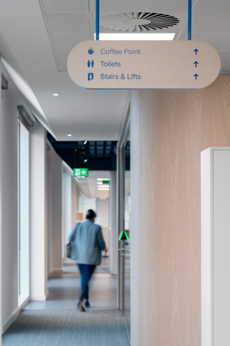
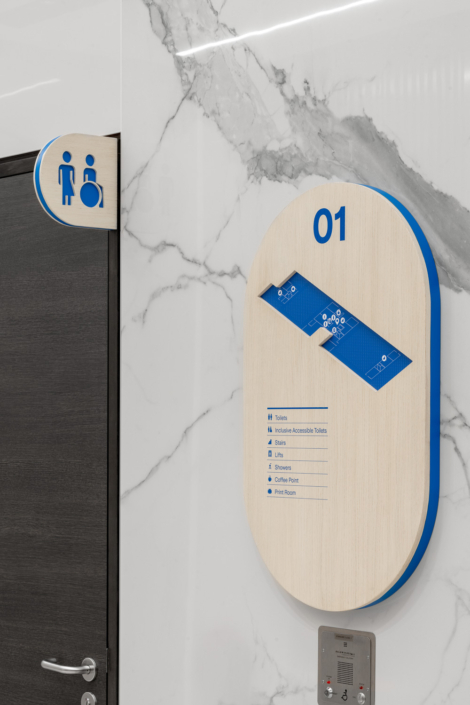
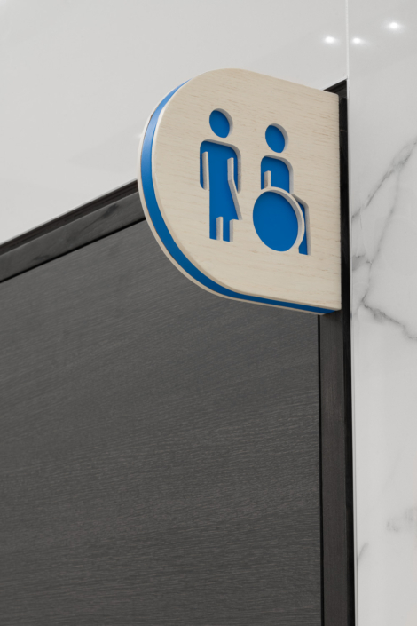
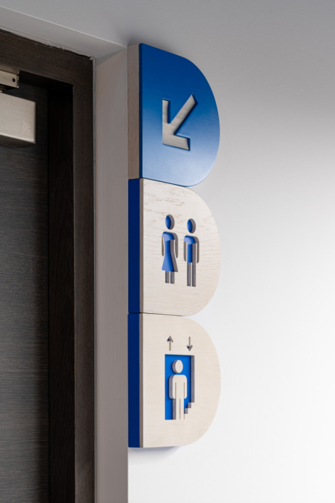
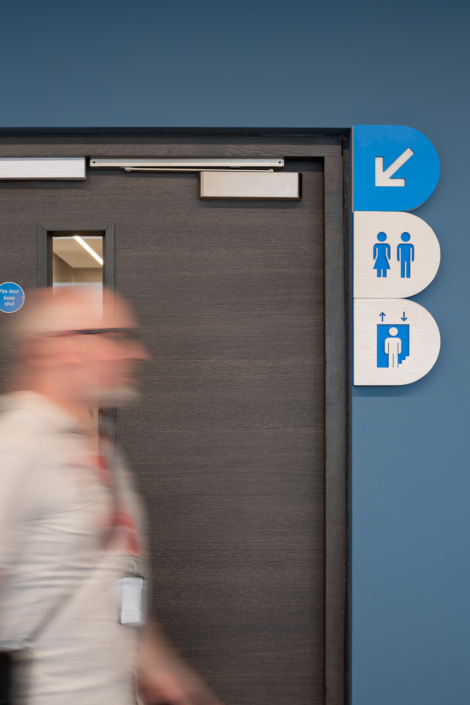
The wayfinding designs were very considered, using a whitewashed oak facia with an mdf core sprayed to the Zurich blue, they honoured both the existing furnishings and the Zurich brand.
The whitewashed oak facia icons were cut through to reveal the blue mdf core, highlighting the strong contrast in colours, thus making sign distinction very clear. Always important in wayfinding!
In the case of the downward arrow, the opposite was applied whereby a blue facia was cut through to reveal the oak core.
The lobby signs were given the same treatment, with the floor map being printed direct to PVC and placed within the cut through shape. The text on the lobby signage was screen printed in the Zurich blue offering clear and distinct legibility.
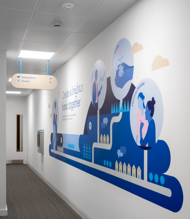
With the overhead generic signage, again we screen printed the text onto the oak, the hang bars where powder coated getting a perfect match.
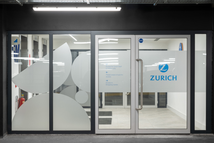
The car park entrance into the building had previously been completely clear of branding on the windows, which led to shoppers mistaking Zurich as an entrance to the local supermarket.
We used a combination of frosted etch and optical clear vinyl resulting in very evident ownership of the entrance to Zurich insurance group
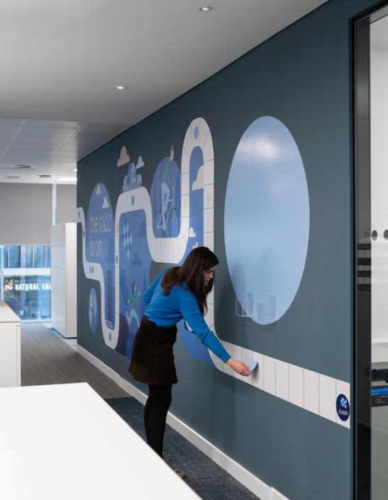
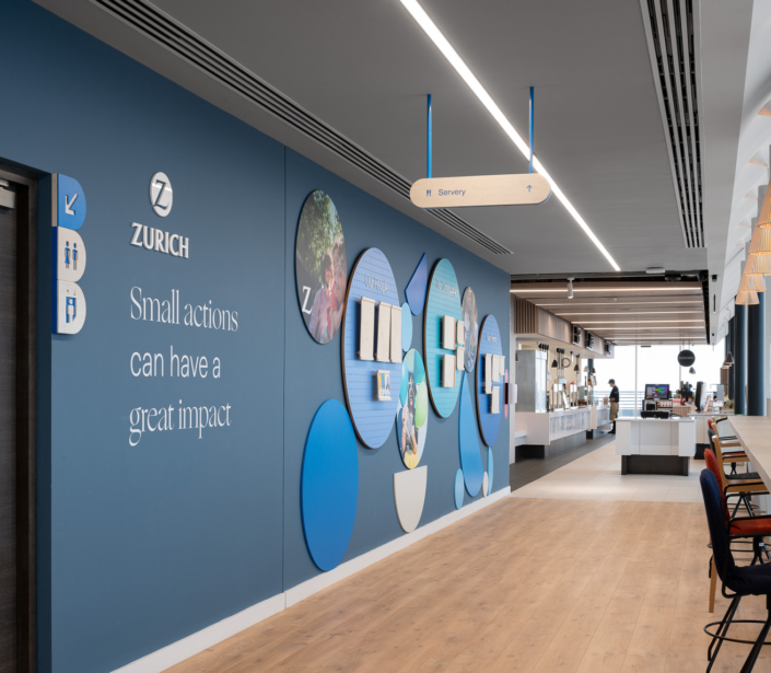
The environmental designs were clever and engaging, using a combination of woods, vinyl’s, Corian and acrylics.
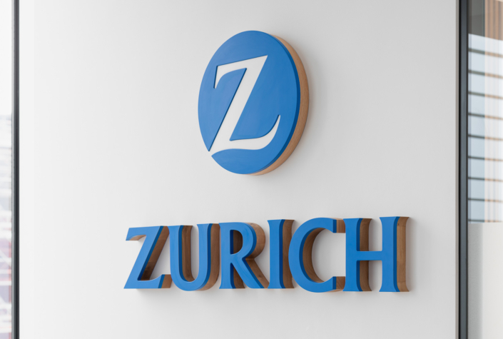
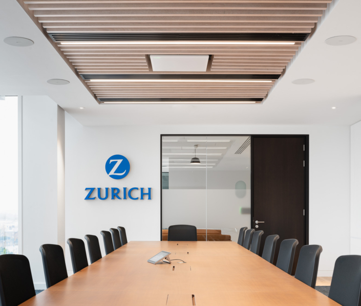
The Zurich boardroom sign uses the same materials as the wayfind, however the Oak is stained rather than whitewashed and the thickness is doubled up to 50mm. The Zurich “Z” is cut from Corian and very slightly recessed within the blue mdf.
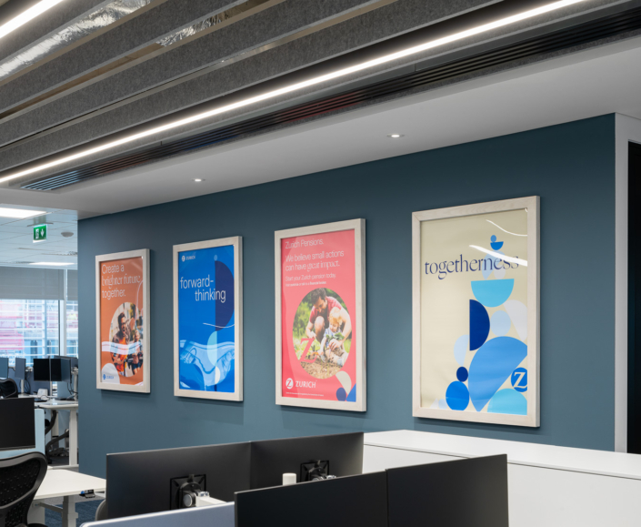
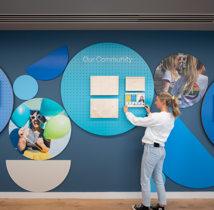
The interactive wall, the interchangeable posters wall and the Our community wall, all serve the purpose of maintaining employee interest and engagement in the environment and the brand.
Challenge’s and solutions
One of the requests from the Zurich team was that if there is a change needed to one of the signs, for example, should the location of an office change, can we minimise works to make that change.
Our facias on all signs are easily replaced as they are held in place by either a clipping or a magnet system.
Continuous communication with the client and presentation of solutions to the challenges kept them involved at all stages, and giving them greater understanding of the processes.
Production and Installation:
Production took 14 weeks from order placement for materials through to installation.
The installation itself took place in Feb whilst the bulk of Zurich staff where working from home. We were lucky in that sense as we could work during the day an get to experience the great view form the top floor at break time.
For us here in Nineyards, this was an absolutely great project to work on and a great company to work with.
Facilities feedback:
Thanks Brendan for the feedback and to all involved in the Project.
Well managed Project throughout with positive results at the end.

